My Blog List

Friday, August 29, 2014

Practical Burial Footwear


I mentioned owning this cover to a few people that collected funeral homes and shoes during last weeks RMS convention and all said they'd never seen nor heard of it before. Well, here it is folks, the Practical Burial Footwear cover I'd been talking about. Patented in October 1942 by Charles F. Schulte, the patent states:
"In the manufacture of burial shoes, certain special requirements arise which depart substantially from normal shoemaking practice. The present invention contemplates and fulfills these requirements." 
The internet being the amazing thing that it is turned up not only the photos below, but also Charles F. Schulte's patent description (goes into gross postmortem detail) as well as the diagram to go with it.


Images are from: pandorasparlor.com

MAD Magazine's Alfred E. Neuman


MAD Magazine's grinning, gap toothed idiot Alfred E. Neuman has graced the satire magazine cover for well over 50 years. MAD may have given him a name, but his image has been around for much longer, so I thought I'd put up a few covers with the kid with no worries.


The first issue of MAD Magazine was published in 1952, years after these two matchbooks were made. 
The two earliest examples I have use variations on Alfred E. Neuman's "What? Me Worry?" slogan.


These two examples (most likely from the 1970's) use two slightly different versions of the MAD Magazine icon. Oddly, neither have the correct gap toothed grin that the older covers above do (the version on the left has no gap, the version on the right has a gap farther over).

Neuman steps in for Newman on my favorite MAD cover ever, December 1997.


Thursday, August 28, 2014

Get A Room


Just recently I've become interested in the Universal Matcharama matchcovers. I like the photos of the 1950's and 1960's mid-century modern architecture and neon signage, like the one above from Miami for the Stardust Motel. I bought a large lot of these at the last United Eastern Swapfest and noticed that a lot of the covers advertising motels had great and often very interesting images of the motel rooms they once offered.


Microscopic amoebas or flowers on those bed sheets? You could decide for yourself if you stayed at the National Motel in Washington, PA. Just look at that rich wood paneling.


I like this one a lot; ice blue wall paint and sheets with abstract pattern curtains and Eames inspired furniture fit the bill at the Drive-In Hotel, complete with a television you have to sit on the end of the bed to watch.


Be sure to ask for the depression inducing puke green room at the Randora Motor Hotel in Detroit. Look at that TV! Unless those are sleeper sofas, this must be the lobby.


I like these Matcharama covers because they're a visual time capsule of the overnight stay culture of the late 50's and early 1960's.

Let's Get Liquored Up


First up is this Universal San Francisco cover for Bruni's Tap Room which was located at 1041 South 1st Street in San Jose. It has some nice script and sans serif lettering and an illustration of the building they're located in. Since I liked the look of the building I thought I'd look it up on Gooogle's street view.


The address differs from what's on the cover, but Google maps the address to this location. It looks like a few buildings nearby have been torn down, so the address numbers may have changed. The location is correct, the architectural details match and you can still see a bracket at the top center that once held the Bruni's sign. There's not much about this place online, but apparently they were famous for cabbage rolls.


The next cover is from Patmar's Drive-In Liquor Store and Motel in El Segundo, California. A quick search on the internet turned up this postcard from the same location. I like how the motel units on the far left look like they're on the edge of a race track.


The Black Cat was located in Danville, Illinois and you won't find that address searching Google Maps. According to this website the building isn't there anymore:
"A few mysteries have been solved — involving the Black Cat Tavern, that is — in the past month. First, Sue Richter, director of the Vermilion County Museum, called me to explain how the Black Cat Tavern ended up having two locations. Richter said the original Black Cat Tavern at 13 S. Vermilion St. burned down on June 8, 1949. 'They called it the Black Cat fire and it wiped out a lot of South Vermilion Street,' she said. According to Richter, a fire wall between the tavern and Palmer Bank prevented the fire from spreading to the bank."

I was able to find the building that was once Bob Read's Top Hat in Phoenix, Arizona, which is now a Mexican tile store.


A few more interesting covers from bars and cocktails lounges that I have in my collection.


Wednesday, August 27, 2014

Press Play - Listen Loudly: Hip Hop and Rap Matchcover Display


I made this about a year ago using Adobe Illustrator CS6 and a lot of old hip hop album covers from the 80's and early 90's. A few people got it, a lot didn't and I'm OK with that. I thought it would be interesting to see what a set of matchbooks with a music theme might have looked like if they had been produced.

Tuesday, August 26, 2014

A Message From Denmark

Just received a nice message from fellow matchbook and matchbox label collector Flemming from Denmark. He liked the MARVA blog and wanted to say hello and share his site as well. He's got over 100,000 covers and labels from 138 countries. So go check out Flemming's site here: www.tandberg.webbyen.dk/

Monday, August 25, 2014

RMS 74th Convention in St. Louis, Missouri


The 5A bus stop is sketchy, but dependable.

Last Sunday I took the 6:45 AM Metro 5A bus to Dulles Airport to head out to the RMS 74th Convention in St. Louis, Missouri. The bus stop was sketchy that early in the morning, but got me there in 45 mins for $7.


A little over two hours later I'm at the Sheraton Westport Chalet hotel in St. Louis. I have some time to get my room and check the place out before things open up later in the day.


The proof sheet for the MARVA 2014 RMS matchbook that was available at the convention.

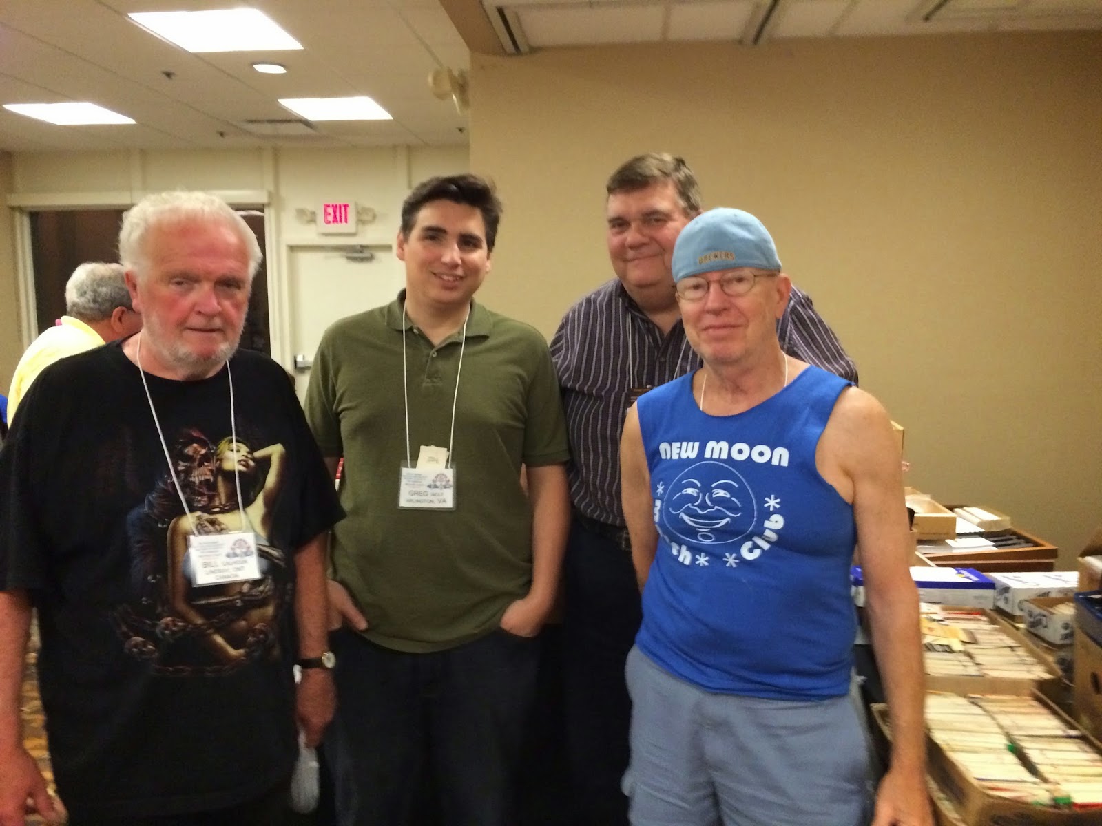
L to R: Bill, Me, Bob and Charlie
During the week I got to catch up with some of my favorite matchbook collectors and friends.


I bought these nice car manufacturer covers from Carol.

Look at that smug cat with it's crown...


Some great dine and dance type covers, one of my favorite categories.


Freebie table covers were great, including these nice sports schedule covers including the 1969 St Louis Cardinals.


Very, very 80's covers.


A really awesome cover for New Moon trailer homes.


Typewriters...


Four nice examples of late 1930's and early 1940's matchcover designs.


Come on down to Cafe Mocambo and watch this Debra Winger-esque woman roll around on a tiger rug.


The moon's face is priceless on this girlie cover.


Here's yet another cover with a lady in a martini glass.


I forget who handed me this cover for the Whiting Hotel in Stevens Point, Wisconsin, but I'm glad they did. The back panel of this cover is pretty funny (see below).


Detail of the Whiting Hotel matchcover depicts a young, orange haired Johnny Bravo (see below) from Cartoon Network fighting a man with deformed trapezius (upper and mid-back) muscles and abnormally low kneecaps while an unidentified gun toting man who may possibly be Colonel Sanders or Uncle Sam watch along with W.C. Fields, a mustached butler with gigantism, and an ugly man in a white dress.


This freebie table bobtail cover is hilarious.


Read it a couple times if you have to.


I like the older industrial covers because visually they're very interesting, but they also represent a time in this country when we designed and built things using our own natural resources that made our lives better and didn't rely on the cheap labor of other countries to manufacture them. The items America produced during this time were of high quality and lasted far longer than the same contemporary items that are now imported. In my opinion all of these old industrial product matchcovers represent the jobs many Americans in this country once had. 

Above: Darling Valves, manufactured in Williamsport, PA and the Nelson Studwelder (my favorite matchcover from the RMS convention).


Roper's Ribs in the Jennings neighborhood of St Louis.

Roper's Ribs was a great choice to try some St Louis style barbecue. Denise and I shared a giant order of ribs, brisket and shrimp that was fantastic. Their potato salad was also very, very good.


A thrift store we stopped at with a vintage 7 Up sign in the window.


"The Mississippi. The mighty Mississip. The old Miss. The old man." -Clark Griswold

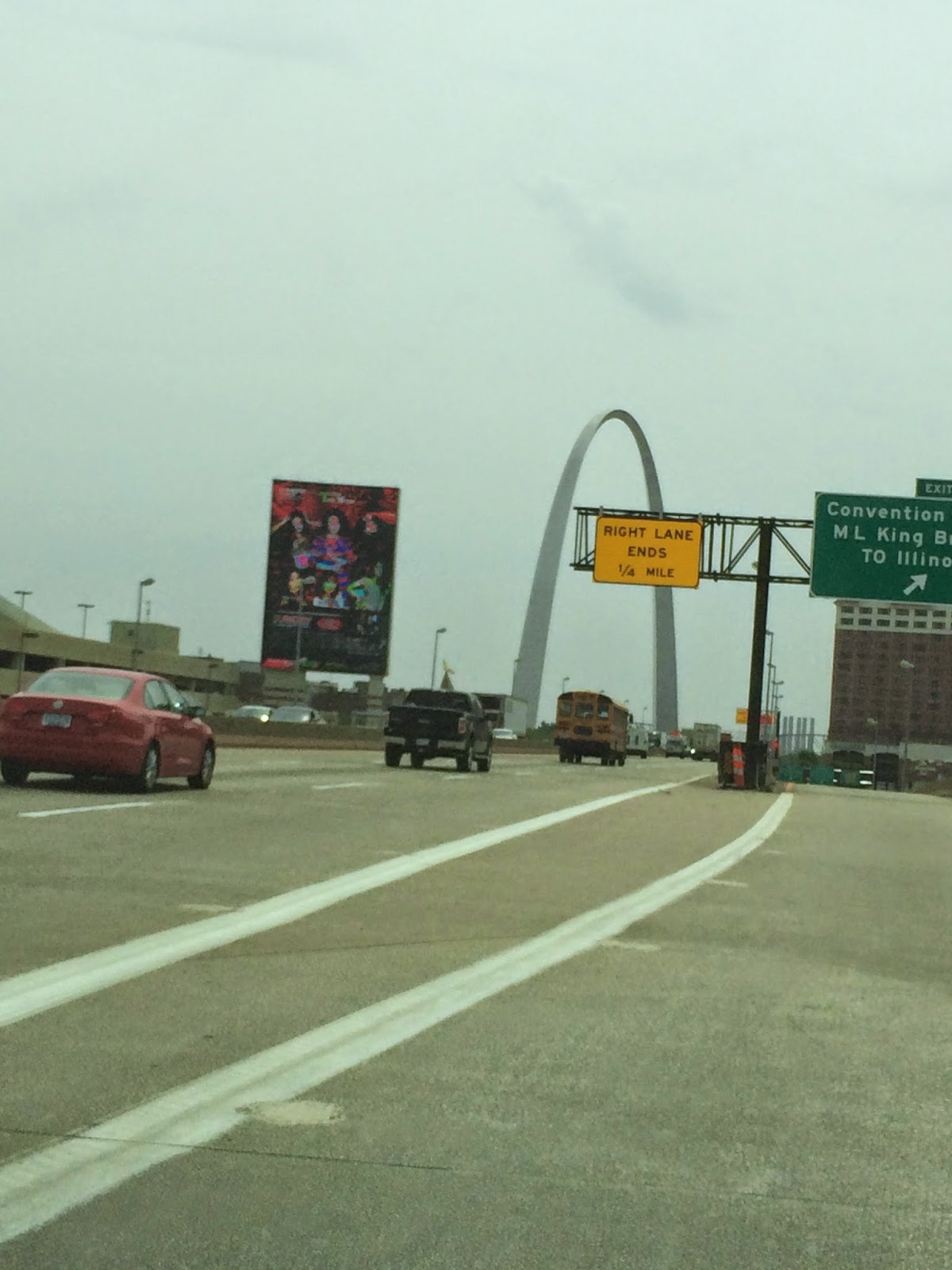
The St Louis Arch is huge and you can see it from the interstate.
"Hey, see that, kids? That's the St Louis Arch, the gateway to the west. It's over 600 feet tall and there's an elevator all the way tot he top. That's 60 stories to you and me."


I actually got to do the thing I wanted to do most on this trip, which was to go and see the St Louis Arch. Thank you Angelus Club president Denise McKinney for taking me out there. You rock.


The Ashley Street / Union Light Power House once provided steam heat and electricity to all of downtown St Louis. The neo-gothic architecture of the building is amazing and I would have loved to have gotten a closer look. More here: http://www.examiner.com/article/ashley-street-power-house-st-louis-s-electric-power-landmark


The 34 four foot tall Vess soda bottle in the the old industrial section of St Louis.

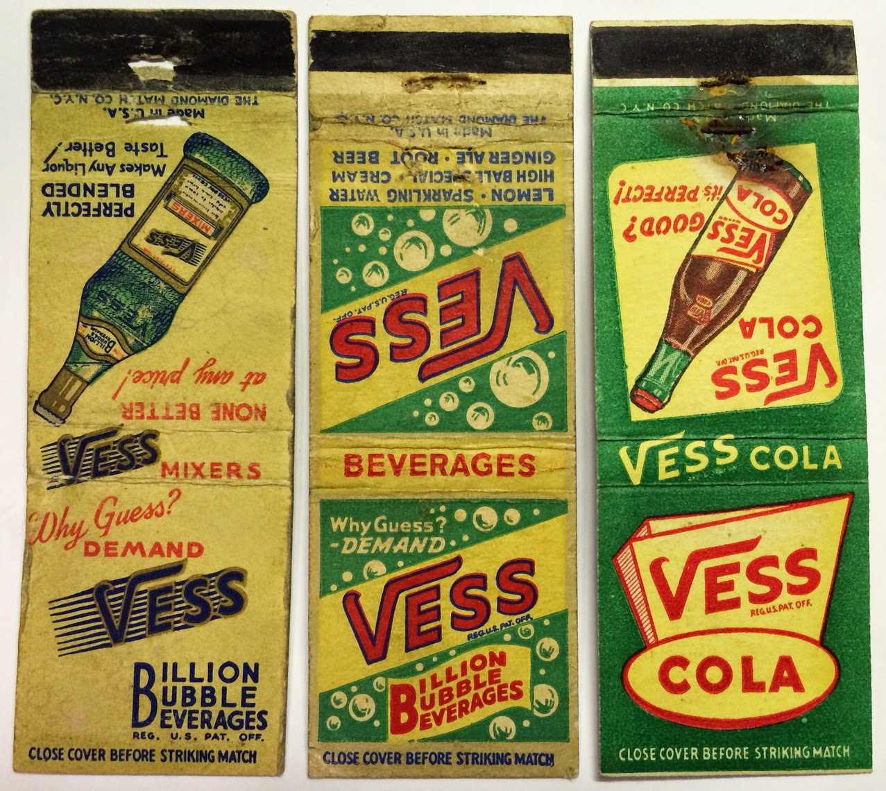
Vess soda matchcovers.
Me in front of the 34 foot tall Vess bottle. Loading dock hobo action in the background.


Busch Stadium, home of the St Louis Cardinals.


Denise and I stumbled onto the TUMS building that was built in 1933 while driving through the city. Check out how the lettering above the doors totally matches the lettering on an older matchcover, below.

"Perhaps the first Modernist building in downtown St. Louis, the Tums factory was groundbreaking in its simplicity. Art Deco influences can be seen in its sparse decoration, but the overall design is pure International Style, with alternating ribbons of windows and brick forming continuous bands around the facade. The tower acts as an accenting vertical element. At the other end, a second vertical component appears to be an earlier building, appearing on a vintage postcard without the International Style section."From http://www.builtstlouis.net/mod/tums-building.html


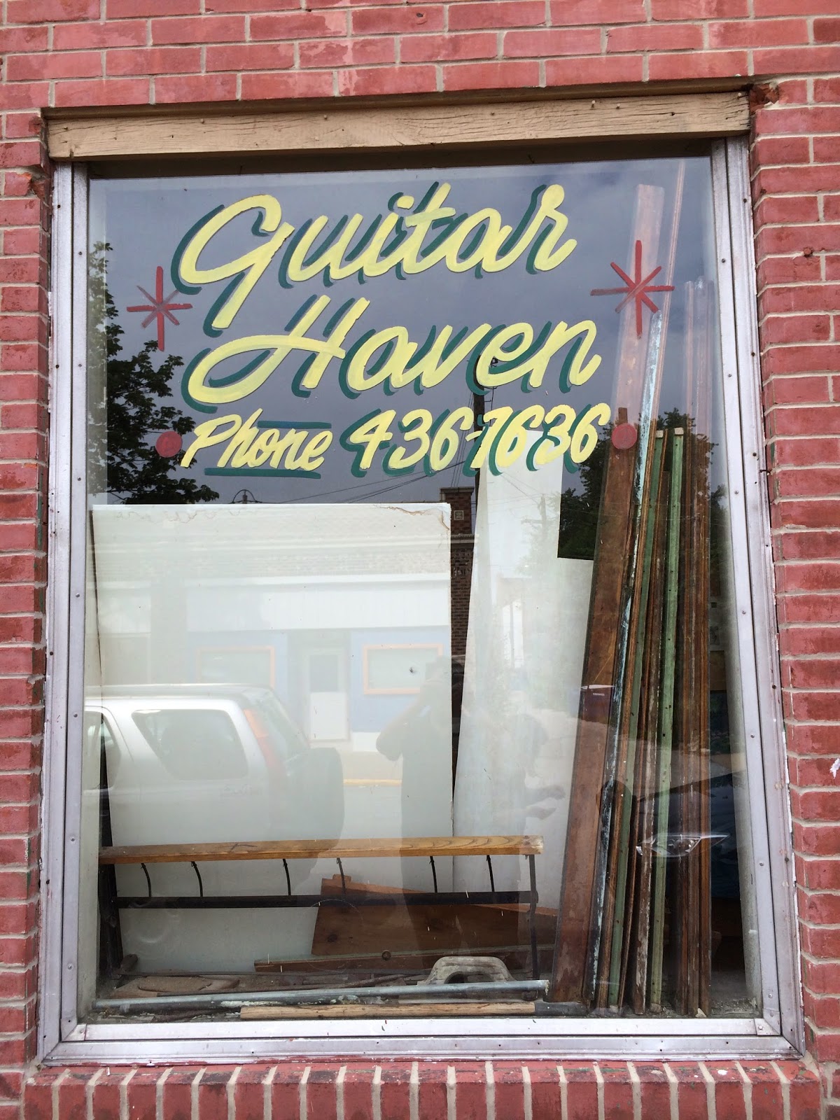
Hand lettering on the window of the Guitar Haven store.

The Crown Candy Kitchen was amazing and it looked like little had changed on the inside over the years.

I'll spend the extra 4 cents and get my horoscope while I'm in the Crown Candy Kitchen.


The Union Light / Ashley Street Power House used to provided electricity and heated steam to the entire downtown St Louis area. See more here: http://www.examiner.com/article/ashley-street-power-house-st-louis-s-electric-power-landmark


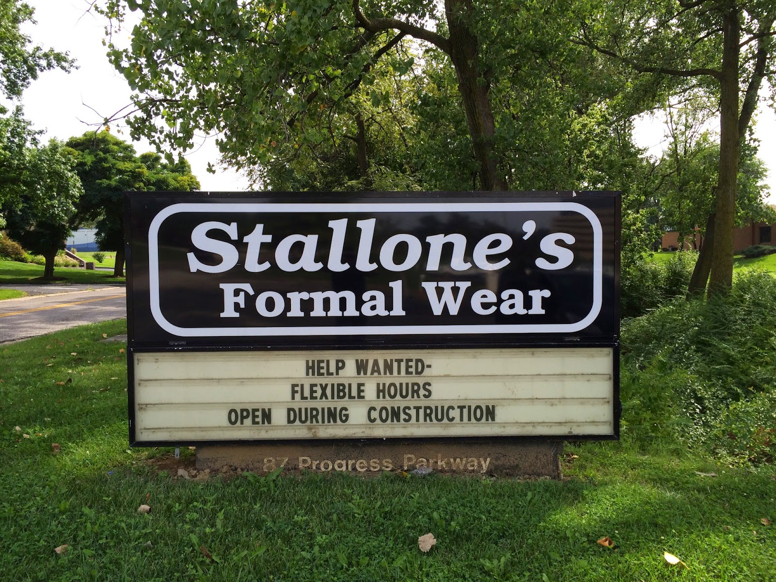
Adrian, get me a tux!

Me and my partner in crime and sister from another mister, Denise McKinney.

After at least six delays due to mechanical problems with the plane and five hours at the airport, I got a different flight out for the next day and went back to the hotel in time to go to the RMS banquet (thanks to Bill Gigantino).


Lucky me, I got to sit next to a guy who spent a good portion of the flight rubbing his knee against my leg and pulling his arm hairs out one by one (see above).